Spacing
Spacing is a powerful tool that determines how elements are positioned relative to each other and emphasizes certain elements while de-emphasizing others. Consistent spacing enhances visual appeal and guides the user's journey through the content. Space relates to size and visual consistency through alignment of baselines, gutters, padding, margins etc.
While Salt provides a general approach to spacing, it isn’t an exhaustive set of guidelines.
The design system uses the same spatial tokens for both spacing. Consistent application of these tokens helps align layouts, establish a uniform visual rhythm, and enhance the overall visual appeal of your application's design.
The Salt spacing system is structured around a base unit of --salt-spacing-100 for each density, with a scale that is proportional across all densities. Every space token within the system is a multiple of --salt-spacing-100 and percentages of the base unit. This scale ensures consistency and flexibility with predictable values that adjust both upward and downward.
| Token | Formula | High Density (HD) (px) | Medium Density (MD) (px) | Low Density (LD) (px) | Touch Density (TD) (px) |
|---|---|---|---|---|---|
--salt-spacing-25 | 0.25x | 1 | 2 | 3 | 4 |
--salt-spacing-50 | 0.50x | 2 | 4 | 6 | 8 |
--salt-spacing-75 | 0.75x | 3 | 6 | 9 | 12 |
--salt-spacing-100 | 1.00x | 4 | 8 | 12 | 16 |
--salt-spacing-150 | 1.50x | 6 | 12 | 18 | 24 |
--salt-spacing-200 | 2.00x | 8 | 16 | 24 | 32 |
--salt-spacing-250 | 2.50x | 10 | 20 | 30 | 40 |
--salt-spacing-300 | 3.00x | 12 | 24 | 36 | 48 |
--salt-spacing-350 | 3.50x | 14 | 28 | 42 | 56 |
--salt-spacing-400 | 4.00x | 16 | 32 | 48 | 64 |
--salt-spacing-450 | 4.50x | 18 | 36 | 54 | 72 |
--salt-spacing-500 | 5.00x | 20 | 40 | 60 | 80 |
--salt-spacing-550 | 5.50x | 22 | 44 | 66 | 88 |
--salt-spacing-600 | 6.00x | 24 | 48 | 72 | 96 |
--salt-spacing-650 | 6.50x | 26 | 52 | 78 | 104 |
--salt-spacing-700 | 7.00x | 28 | 56 | 84 | 112 |
--salt-spacing-750 | 7.50x | 30 | 60 | 90 | 120 |
--salt-spacing-800 | 8.00x | 32 | 64 | 96 | 128 |
--salt-spacing-850 | 8.50x | 34 | 68 | 102 | 136 |
--salt-spacing-900 | 9.00x | 36 | 72 | 108 | 144 |
--salt-spacing-950 | 9.50x | 38 | 76 | 114 | 152 |
Spacing is a powerful tool to emphasize certain elements while de-emphasizing others, guiding the user's journey through the content. Salt recommends using varied spacing (--salt-spacing-300, --salt-spacing-200, --salt-spacing-100) between elements to establish a visual hierarchy. The vertical separation of items such as headings, blocks of text, form elements and cards should follow a consistent pattern to create visual rhythm.
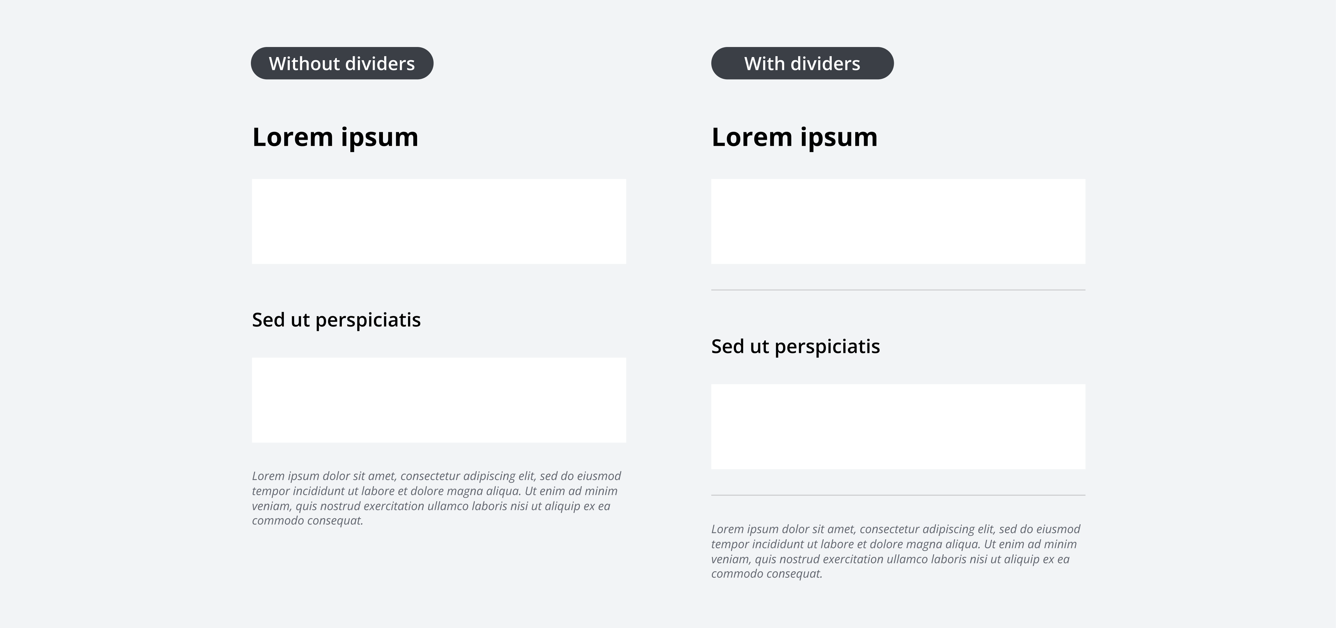
Horizontal dividers are used to divide regions of a layout and should be spaced consistently with salt-spacing-300 above and below sections. For more information on dividers, please refer to the divider component page.

Headings serve as the primary title for different content types by providing visual separation and hierarchy. All headings should be accompanied by standard spacing above and below. The spacing placed directly below a heading depends on the level of focus placed on the item.
To find out more about how to use spacing in headers, please refer to the forms pattern page.
| Heading | Space above | Space below |
|---|---|---|
| H1 | --salt-spacing-200 | --salt-spacing-300 |
| H2 | --salt-spacing-200 | --salt-spacing-200 |
| H3 | --salt-spacing-200 | --salt-spacing-100 |
| H4 | --salt-spacing-200 | None |
A container represents an enclosed area with information, this is typically anything that is in a div in code. Padding is the space inside a given area, controlling the distance between its content and boundary. Padding in containers varies depending on the container size.
Please refer to the header block pattern page to learn more about container padding in context.
| Container size | Padding size |
|---|---|
| Large | --salt-spacing-300 |
| Medium | --salt-spacing-200 |
| Small | --salt-spacing-100 |
Horizontal spacing between items can vary depending on relationship and context.
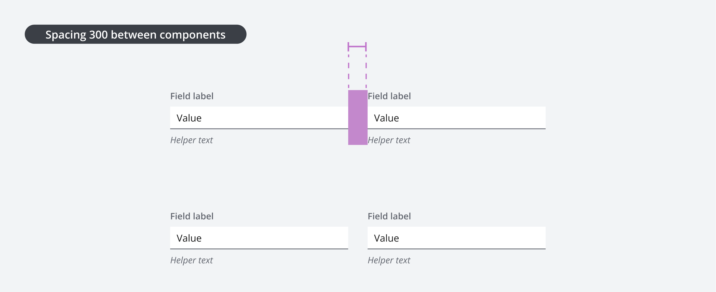
Standard spacing between items in a form is typically --salt-spacing-300, which aligns with the design systems responsive layout grid, and automatically will adjust depending on what density you use.
| Horizontal spacing | Space between |
|---|---|
| Buttons | --salt-spacing-100 |
| Components | --salt-spacing-300 |

Standard spacing between related items, such as buttons in a button bar group, is typically --salt-spacing-100.

We appreciate your thoughts and feedback on any content in the Salt foundations. Please contact us if you have any comments or questions.