Header block
Header block is a standardized header for container components and application regions, used to display various text elements depending on scenarios. Headings can also display accent and status to highlight messaging.

Use this pattern to:
- Display a combination of headings, pre-headers and descriptions within container components such as Dialog, Drawer and Overlay. This can help provide clear context and purpose of a component or interaction within a UI.
- Maintain a visually consistent layout and presentation for headers, and establish visual hierarchy of headings with supplementary text across different components and content layouts.
- Display headings with status icons to communicate different statuses, depending on the context of the component the header block sits within.
Note: some Salt components, such as Dialog and Overlay, have header block embedded in by default, across both code and figma.
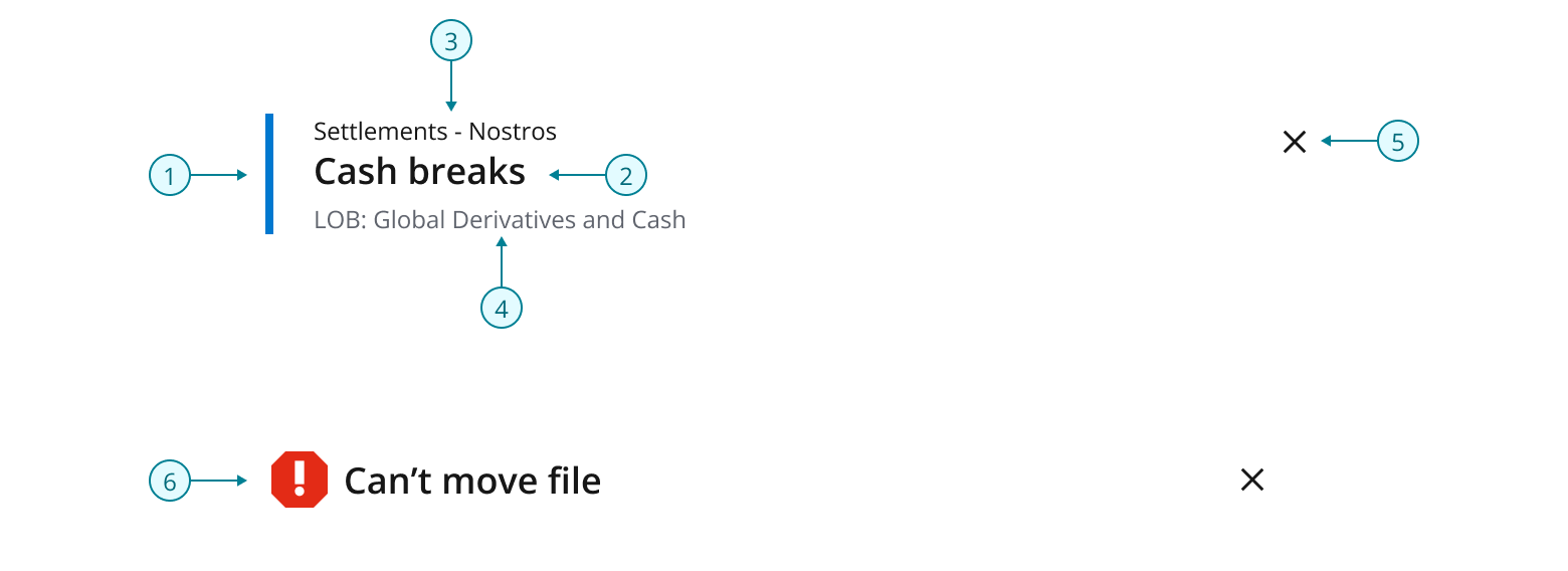
The header block pattern comprises the following visual and text elements:
- Accent bar: Spans the height of, and brings attention, to the heading and supplementary text.
- Heading: Serves as the primary title of a content type.
- Pre-header: Displayed above the main heading. Used to introduce a section or draw attention to important information, such as a grouping or step in a process.
- Description: Displayed below the main heading as a secondary text element that provides additional information or context to the main title. Brief descriptions can be used to clarify the main title, or provide further details about the content of the design.
- Close button: Optional action for the user to dismiss a component or element.
- Status icon: Visual indicator that communicates status.
Header block can be configured to be displayed using three different sizes, each differentiated by the size of the padding and the heading type. We recommend using an appropriately sized header block, relative to the container element it is embedded within.
As a rough guide:
- A large container in Salt uses padding size of
--salt-spacing-300. - A medium container uses
--salt-spacing-200. - A small container uses
--salt-spacing-100.
For example, a Dialog component might be considered a large container. In this case it uses --salt-spacing-300 for its inner padding, therefore embedding a header block also using --salt-spacing-300 maintains a consistent layout.
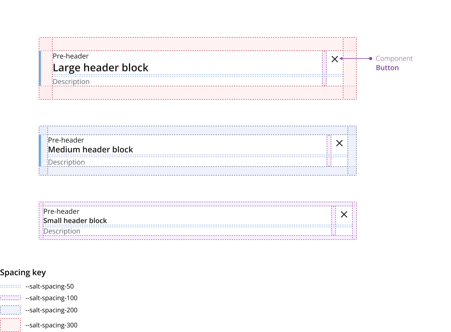
We recommend a header block using --spacing-100 doesn’t have an Accent bar due to restricted space and reduced need for visual emphasis in contexts where its commonly used.
Display header block with an accent bar to draw attention to the heading. In Salt themes the accent bar will display the core brand color.
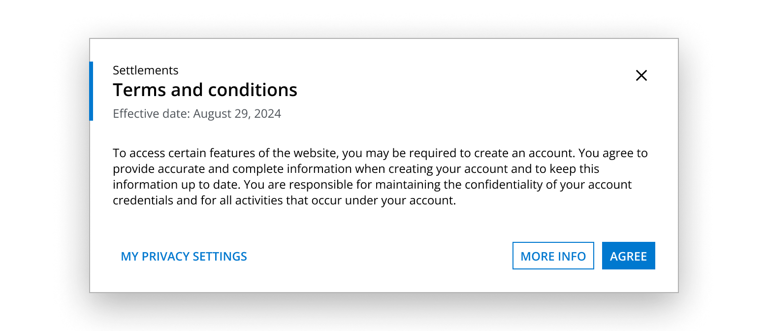
This dialog example demonstrates a step in a process as introduced by the pre-header and heading. A description is not necessary as the content of the dialog is sufficiently self-explanatory for the user to navigate and complete the form field instructions.
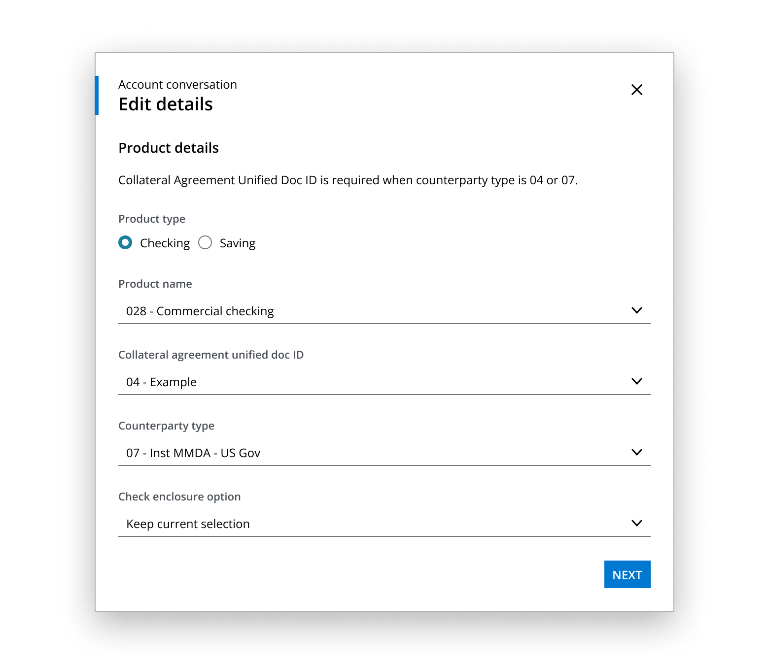
This drawer example uses a heading accompanied by a description that provides additional information on the status of the content. A contextual overview of the content is not required in the form of a pre-header, as the content itself indicates a summary of information.
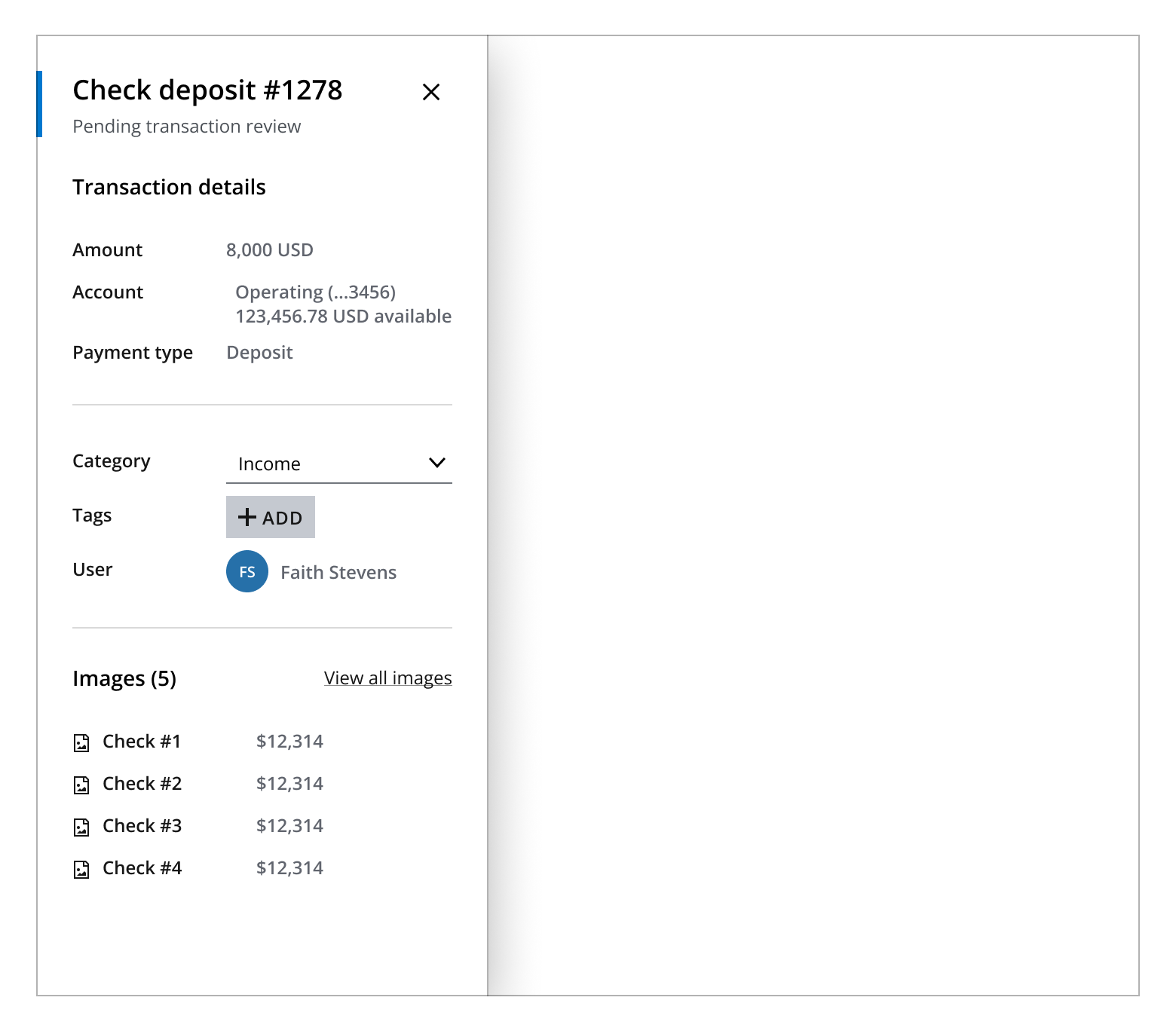
This overlay example shows a header block using --salt-spacing-100 padding with a title and close button.

Display a close button if a container element needs to be dismissed via a close button.

Display header block with status icons to communicate different statuses, depending on the context of the component the header block sits within.

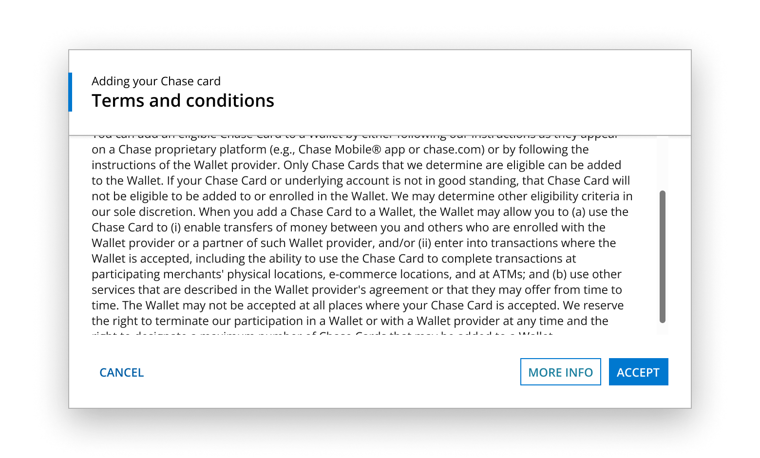
If content within a container exceeds the available viewport height, header block should be displayed with the secondary Divider component spanning horizontally between the left and right edges of the container and an --salt-overlayable-shadow-scroll shadow directly below it to visually signal content contained within a scrollable area.
A scrollbar can be displayed beneath the Header block and should be used to allow users to access all the content without resizing a container.
If you need to expand the pattern or share feedback with us, please contact the team.